Most pressure washing websites lose leads before the visitor ever scrolls.
Not because the business is bad. Because the site gives someone no reason to trust you in the first few seconds, and by the time they find the contact form, they've already opened a competitor's tab.
Layout is the order in which you earn someone's trust. Get it wrong and a ready-to-book homeowner bounces. Get it right and your phone rings instead of your competitor's.
Why Layout Is the Real Problem
Local customers scan, they don't read. They're looking for three things fast: Do you work in my area? Have you done this before? How do I reach you?
If your site makes them hunt for any of those answers, you've already created doubt, and doubt kills conversions faster than bad pricing does.
When DivWebDesign looks at a pressure washing site, these are the first things we check: is there a clear first sentence, is there visible proof early on, and is there an obvious way to request a quote? Most sites fail at least two of the three. Here's how to fix that.
The Hero Section: Answer Three Questions Before the Scroll
The hero, what someone sees before they touch the scroll bar, is your highest-value real estate, and most pressure washing sites waste it with a vague tagline and a stock photo.
Your hero needs to answer three questions without the visitor moving at all:
- What do you do? Pressure washing, soft washing, or exterior cleaning.
- Where? Your town or county, in the headline or right below it.
- What should I do now? One button, one action.
The headline should be specific enough that a local homeowner recognizes themselves in it. Something like "Bucks County Pressure Washing - Driveways, Patios & Siding" lands faster than anything clever.
For the CTA button, specific beats generic. "Get a Free Quote" works. "Text Us a Photo for a Fast Quote" tends to work better because it tells the visitor exactly what the next step looks like.
And use a real photo. A before-and-after from an actual job does more for trust than any stock image of a power washer.
Proof Above the Fold
If someone can't see any proof that you're legit in the first scroll, they have to take your word for it. A lot of them won't.
This doesn't have to be a big reviews section. A simple trust bar just below your hero, your Google star rating, the towns you serve, and a one-liner like "licensed and insured," takes up minimal space but does real work.
People aren't just looking for a pressure washer. They're looking for their pressure washer. The faster your town or county appears on the page, the sooner a visitor relaxes.
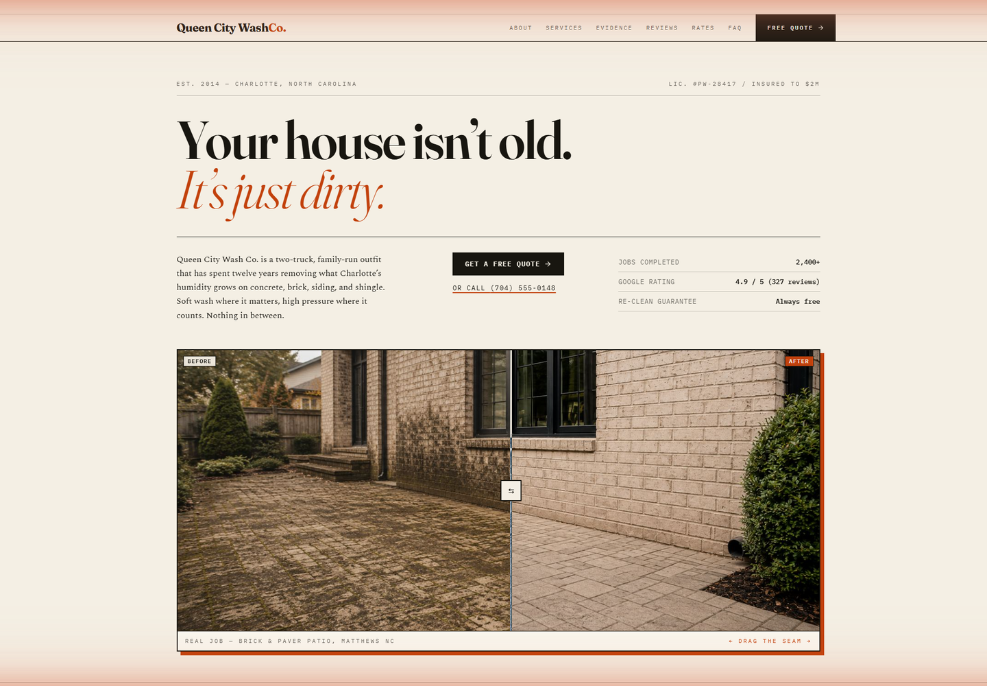
Before & After Photos
For a pressure washing business, before-and-after photos may be your strongest trust signal, and most sites treat them like an afterthought buried halfway down the page.
Putting a strong before-and-after near the top of the page, before the visitor has had time to build doubt, changes how the rest of the site reads. They've already seen the result. Everything else is just confirming they should reach out.
What makes these photos actually convert isn't just the visual quality. It's the specificity. A caption like "Concrete driveway - tire shadowing and leaf tannins - Oxford Drive, Yardley" does more than "driveway cleaning." A local homeowner reads that and thinks, that sounds like mine. Generic captions don't create that connection.
Show the location when you can. Show what the actual problem was. Keep the descriptions short. This is the same approach you'll see in the DivWebDesign portfolio: specific job context rather than vague proof.
A Services Section That Actually Helps People Decide
"We clean all exterior surfaces" doesn't help someone decide. It just puts the work back on them.
If a homeowner is wondering whether you do stamped concrete, they need to see "stamped concrete." If they're on the fence about soft washing their siding, they need to see that you understand the difference between soft washing and pressure washing and when to use each.
Break it out by surface: driveways, patios, siding, walkways, decks, and fences, with a sentence of specifics under each one. If you're comfortable listing price ranges, include them. Even a ballpark like $175-$425 for most driveways removes one of the biggest friction points: "I have no idea what this costs."
Vague service descriptions make buyers feel uncertain. Specific ones make them feel like they found the right business.
Service Area Pages
If you serve five towns but only mention your city once in the footer, you're hard to find for customers in four of those towns.
A dedicated section listing every town you serve, ideally with links to individual pages for each, is one of the more practical SEO moves a local pressure washing site can make. Each page should include the town name throughout, what you commonly clean there, and a quote CTA.
When someone searches "pressure washing Newtown PA," a page titled and written around that specific town has a reasonable shot at appearing. A homepage that mentions Newtown in a list probably doesn't.
It's not flashy work, but it tends to pay off.
The Quote Path
Having a contact form at the bottom of your page isn't the same as having a clear quote path.
A visitor should never have to scroll through two or three full sections without seeing a way to reach you. That means having a CTA button or link at multiple points on the page, not just at the end.
The form itself should be short. Name, phone or email, their town, and what they need cleaned. That's enough to start a conversation. Every extra field reduces the chance someone actually submits it.
The button copy can be as simple as "Get a Quote" or "Request a Free Estimate." What matters is that it's visible, that it shows up more than once, and that clicking it feels easy.
Mobile First, Not Mobile After
Most homeowners looking for a local pressure washer are on their phone, probably standing in the driveway noticing the staining, or scrolling after a neighbor mentions their freshly cleaned patio.
A site that looks fine on a desktop but feels cramped or slow on a phone is turning away most of its traffic. This is one of the core things DivWebDesign builds around. Every site we put together is designed for the phone screen first, not adapted to it after the fact.
A few things that matter more on mobile than people give them credit for: button size, load speed, and making sure the most important action, calling or requesting a quote, is reachable without a lot of scrolling.
If your site looks great on your laptop, pull it up on your phone before you decide it's working.
Quick Layout Reference
If you're rethinking your page structure, here's an order that tends to hold up for local pressure washing sites:
- Hero: local headline, real photo, one CTA button.
- Trust bar: rating, service towns, and licensing.
- Before-and-after photos: specific, with job context.
- Services: broken out by surface, with specifics.
- Mid-page CTA.
- Reviews: location and surface context if possible.
- Service area section: towns with links.
- How it works: short 3-step process.
- Final CTA.
No long company history. No "our values" section above the fold. Just the information a local homeowner needs to decide you're the right call.
Not Sure Where Your Site Stands?
If some of this sounds familiar, vague service descriptions, no visible proof, a contact form that only shows up at the bottom, it's worth taking a look at what a rebuilt version could look like.
DivWebDesign builds mobile-first websites for local service businesses, including pressure washing companies that want their site to actually pull in quote requests. You can see how we approach it in the portfolio.
If you want to see what a stronger version of your own site could look like before committing to anything, request a free mockup. We'll show you the better direction first.